Klima101
Visual Identity • Product Design • Website DesignCLIENT
Klima101 – Climate Change NGOSCOPE OF WORK
- Logo
- Iconography
- Illustrations
- Handbook Design
- Website Design
- UI/UX
TEAM
- creative direction & design – Sofija Marjanović
- web development – Stefan Trbojević
ABOUT

Background:
Klima101 is an NGO and a news website covering all things climate change. Even though it’s covering worldwide news and events, the target audience is local to the Balkan region. Klima101 has a mission of educating people about climate change.
Project:
Their previous website was built on a WordPress theme that had its limitations so over the years Klima101 grew out of it, and decided they needed a custom WordPress website that can be tailored to their needs, both for users but also for their editors and authors who are managing the website content.
The goal was to ditch the old blog-looking website and become a trustworthy news website. We needed to simplify the user flows on the website, reorganise the content, enable better engagement, and build a stronger brand.
Constraints:
- We had a deadline of 4 weeks, for both the design and the development. Later, the deadline was moved to make more time for development, however the design process was completed in under 3 weeks.
- Because the website was built for WordPress, we had some limitations we had to work around for the backend but also for the frontend in order to keep the website working smoothly and to keep the backend simple.
VISUAL DESIGN

Klima101 started with just a logo design and nothing more to the visual identity. The rest of the visual identity was developed over time. The final version was developed with the website redesign.
Most prominent elements of the visual identity are black and green colours, bold typography and outlines that can be seen in icons, illustrations and design system elements.
Some of the icons and illustrations
More than 30 icons and illustrations were created for the website, social media and the digital handbook.

Examples of iconography style

Examples of illustration style

Infographic designs
These designs were used on landing pages but also on single post pages and social media.
PRODUCT/WEB DESIGN

Website content
Most of the website content are posts/articles and we have organised them into 10 different categories based on the content themes.

Simple user flow

Part of the design system

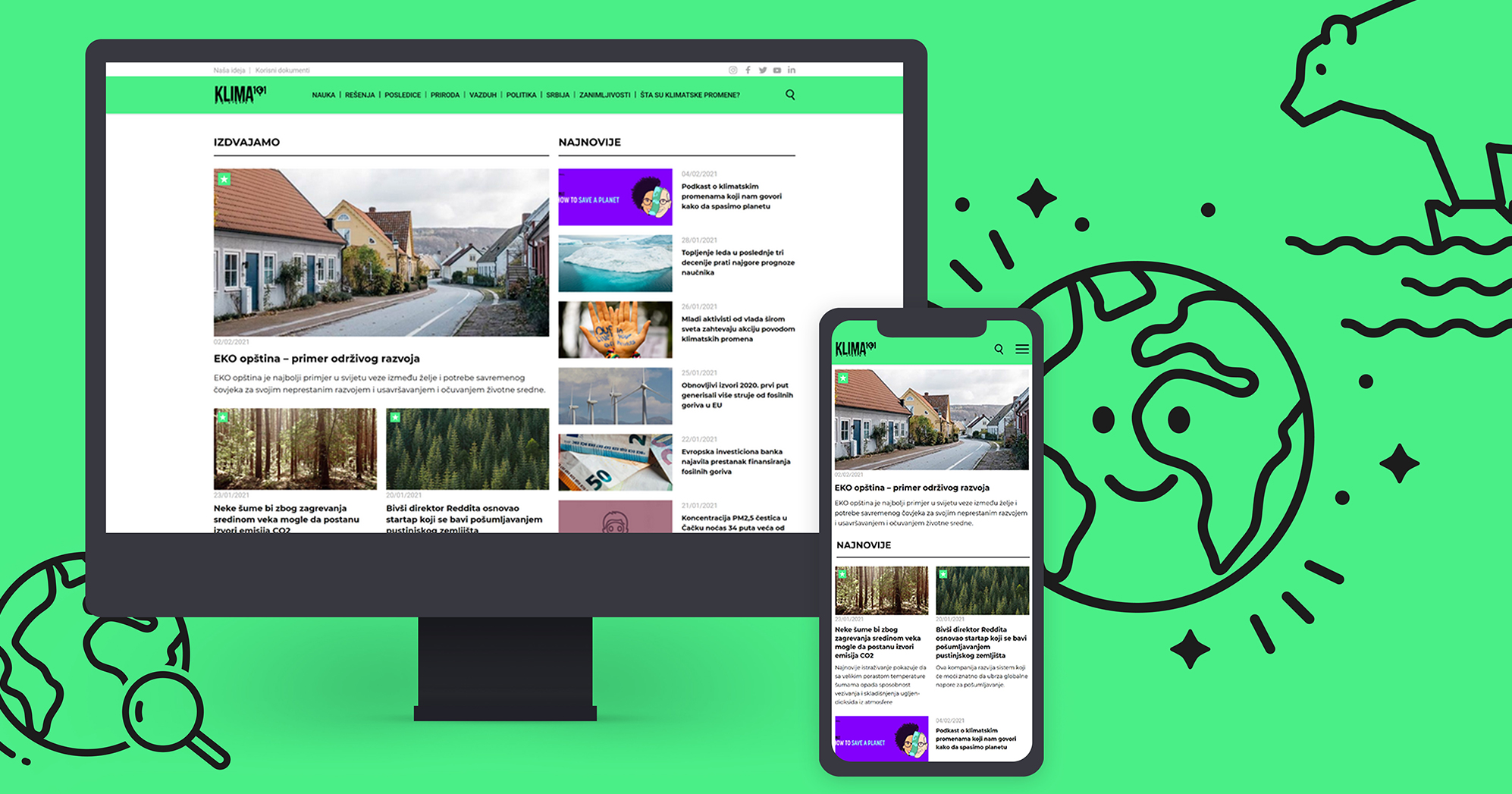
Homepage
- On the left side there are 3 “featured” articles that are handpicked by the website administrator. One occupies a prominent position, and the other two are inferior. Those are the articles the editors consider most relevant for the readers at a certain point in time.
- On the right side there is a list of the most recent articles in chronological order, including all the categories. The layout and content is a bit modified for smaller resolutions but follows the strategy.
- The second section on the homepage consists of a few articles that are the introduction to climate change for first time visitors.
- After that section there are sections devoted to each of the article categories. Each category section consists of 5 most recent articles in a specific category.
- Team section
- Sponsor section

Single post page
We have decided to add a few inline sections on the single post pages in order to reach some of the website objectives:
- Categories the post belongs to. Each card is clickable and opens a new page with all the posts that have that same category.
- Post information: date of publication, author and comments. Name of the author is linked to an author page that contains their photo, CV and all the posts that author has published.
- Sidebar sections: Newest posts and a list of all the categories.
- Quotes: This section is added manually by editors and can be added anywhere in the copy. This sections help readers to quickly see the most important parts of the post and keeps them engaged.
- Suggested post: This section is also added manually and the posts in this section are selected by editors in order to provide the most relevant content and keep readers longer on the website by suggesting content similar to the one they’re reading.
- Newsletter subscription: Read more in the section below.
- Social media links.
- Similar posts grid that contains automatically selected posts based on the category and the tags the posts belong to.
- Comment section: Read more below.

Content categories
There is one extra category that ties all of the categories together, and that is the “original content” category, that includes the articles wrote by the researchers and journalist exclusively for Klima101.
Those posts/articles are marked with a star badge over the featured image so readers can easily notice them in a grid in every category or page on the website.

Newsletter subscription sections
One of the new website objectives was to gain more newsletter subscribers so we have decided to add two subtle (non-intrusive) ways for readers to subscribe. One is an inline section for single post pages that is added manually in the best place so it isn’t breaking the text in a weird position, and the other is a fixed section just above the footer section.

Comment section on single post pages
This is one of the new functionalities added in order to get more interaction between authors and readers but also between readers themselves. Klima101 wanted to be able to discuss climate change issues with their readers outside social media.

The process of leaving a comment on a mobile device